Discuss, research, & outline various different site design concepts
Case Studies
The Process
Ideation:
Design:
Create initial rendering of agreed upon site design mock-up
Develop:
Develop site modeled after finalized design, including smaller site details
Iterate:
Present draft of completed website, make required adjustments, and reiterate as necessary
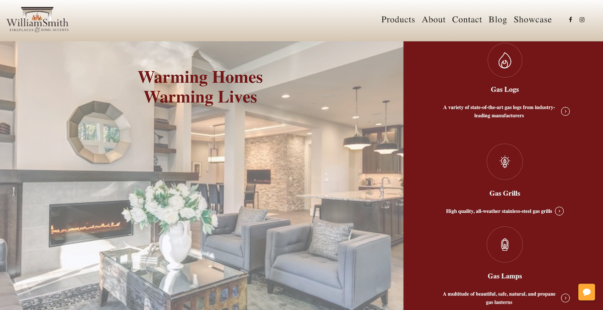
Logo with Transparent background to blend better with Navigation bar
Crisp, attractive hero image with pale white overlay, & bold slogan in company colors
Social Media accounts linked in Navigation bar, along with balanced spacing between menu items
Click-through icons, title, & brief description that link to various service/product pages
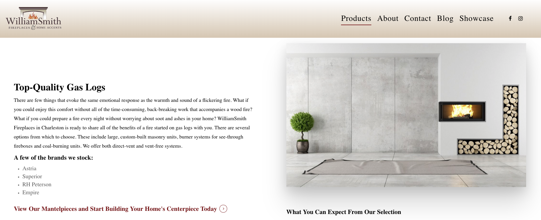
Persistent Navigation bar that stays in place upon scrolling
Generous whitespace around description paragraph and click-through funnel
Large box shadow surrounding image, adding depth of field to the page
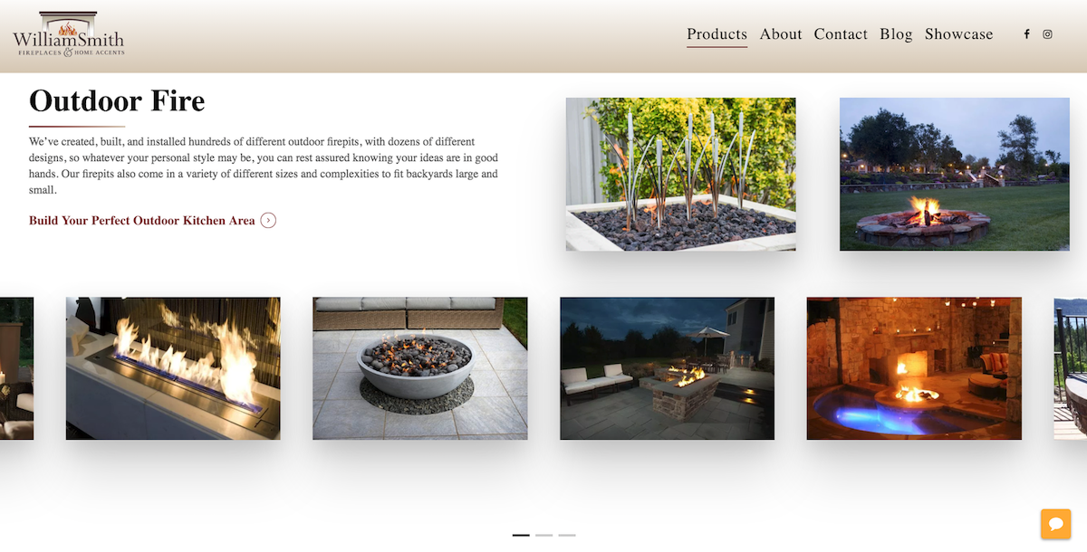
Click-through Call-to-Action (CTA) below paragraph composed of company font, along with company-colored gradient divider line.
Previous, crisp & clear product images with auto-rotating sliding carousel
Generous, balanced whitespace present throughout website
Clean, click-through product images of a featured collection
Click-through images, which link to featured collections below company CTA
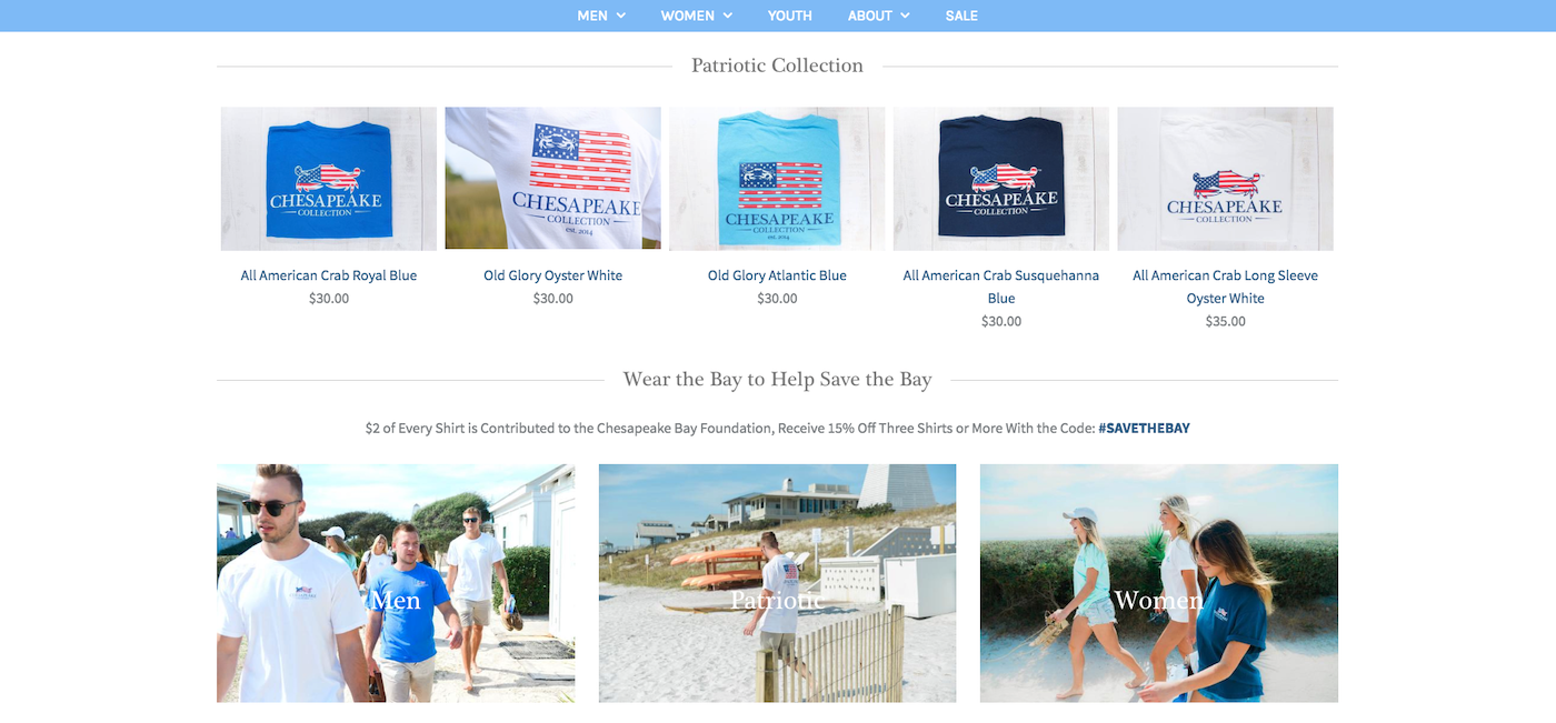
Generous, balanced whitespace present throughout website
Clean, click-through product images of a featured collection
Click-through images, which link to featured collections below company CTA
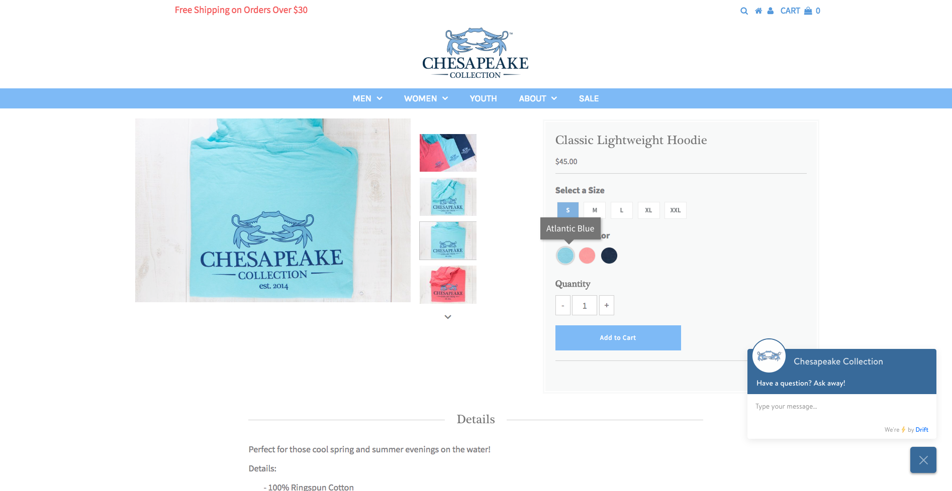
Various scrollable product images visible on click
Size and color variation buttons, which display color variation title on hover
Product description & details below main product image
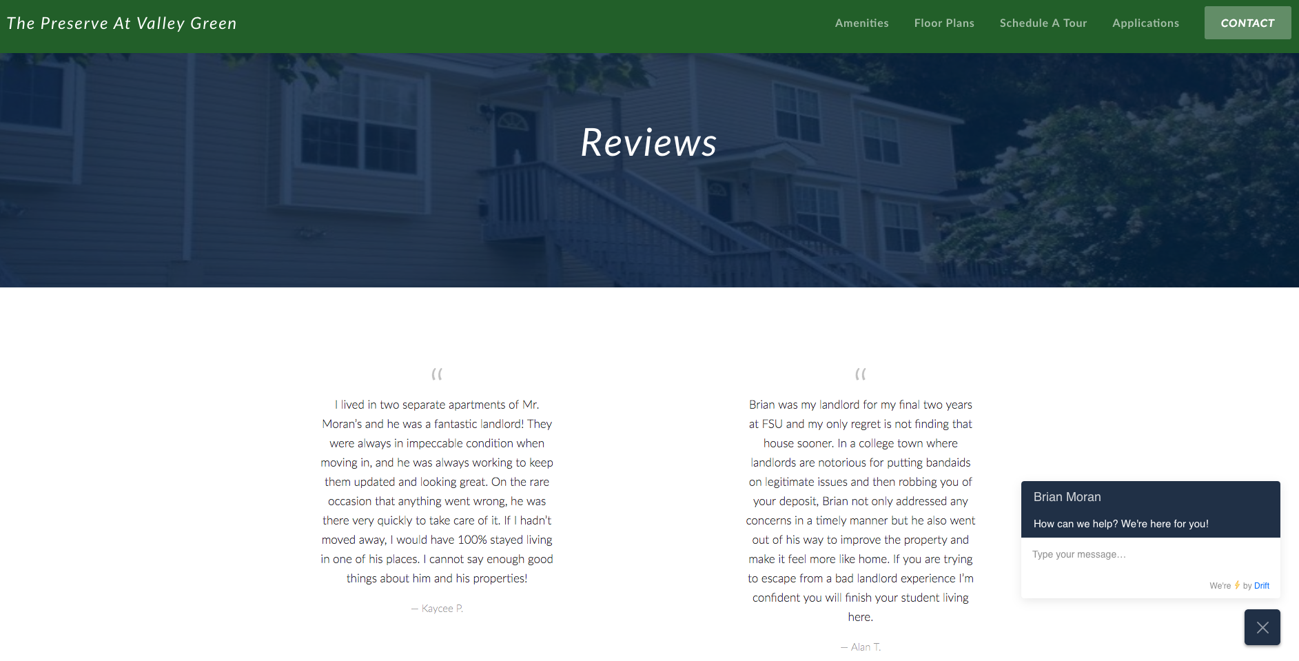
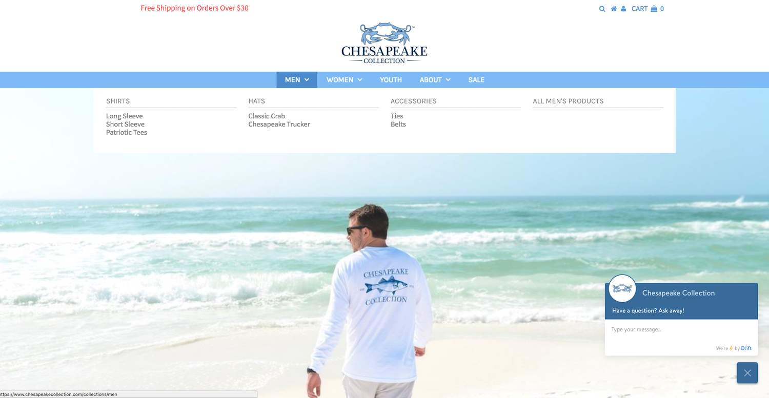
Persistent Navigation bar that stays in place upon scrolling, with balanced menu items
Limited divider image with pale blue overlay & section title
Balanced whitespace throughout website, with prior tenant testimonials
Interactive chat bot triggered on click
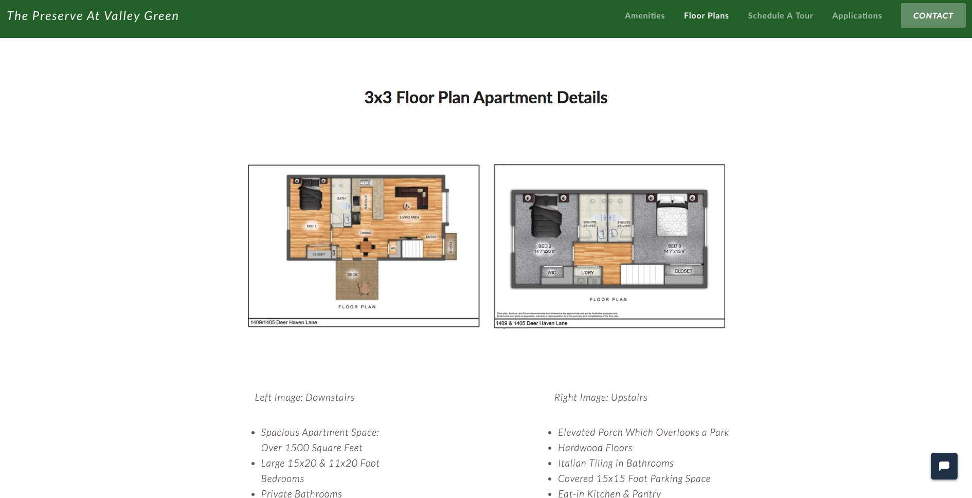
Dual floor-plan images that clickthrough to full-screen dark lightbox
Image details in bullet-point form surrounded by expansive whitespace
Large box shadow surrounding image, adding depth of field to the page
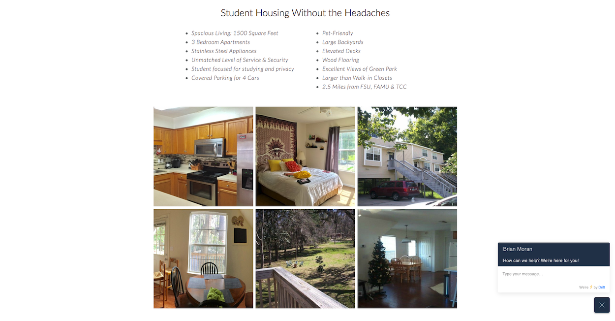
Business slogan, followed by bullet-point list of most favorable amenities offered
Attractive image gallery inviting prospective tenants to explore site
Persistent chat-bot triggered on click
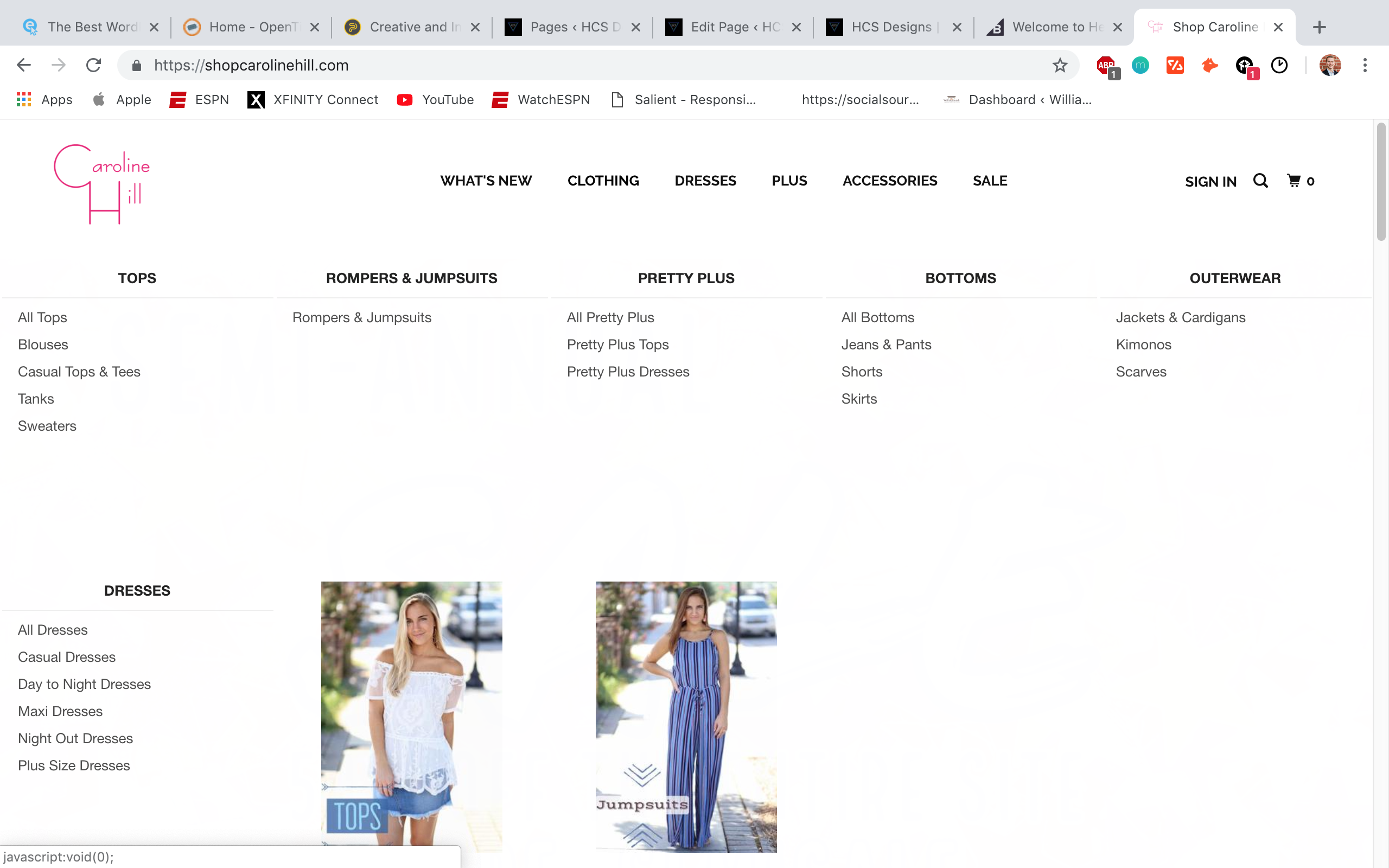
Recommended products section at the bottom of each individual product page, to encourage customers to continue shopping for more items based on products already in their cart
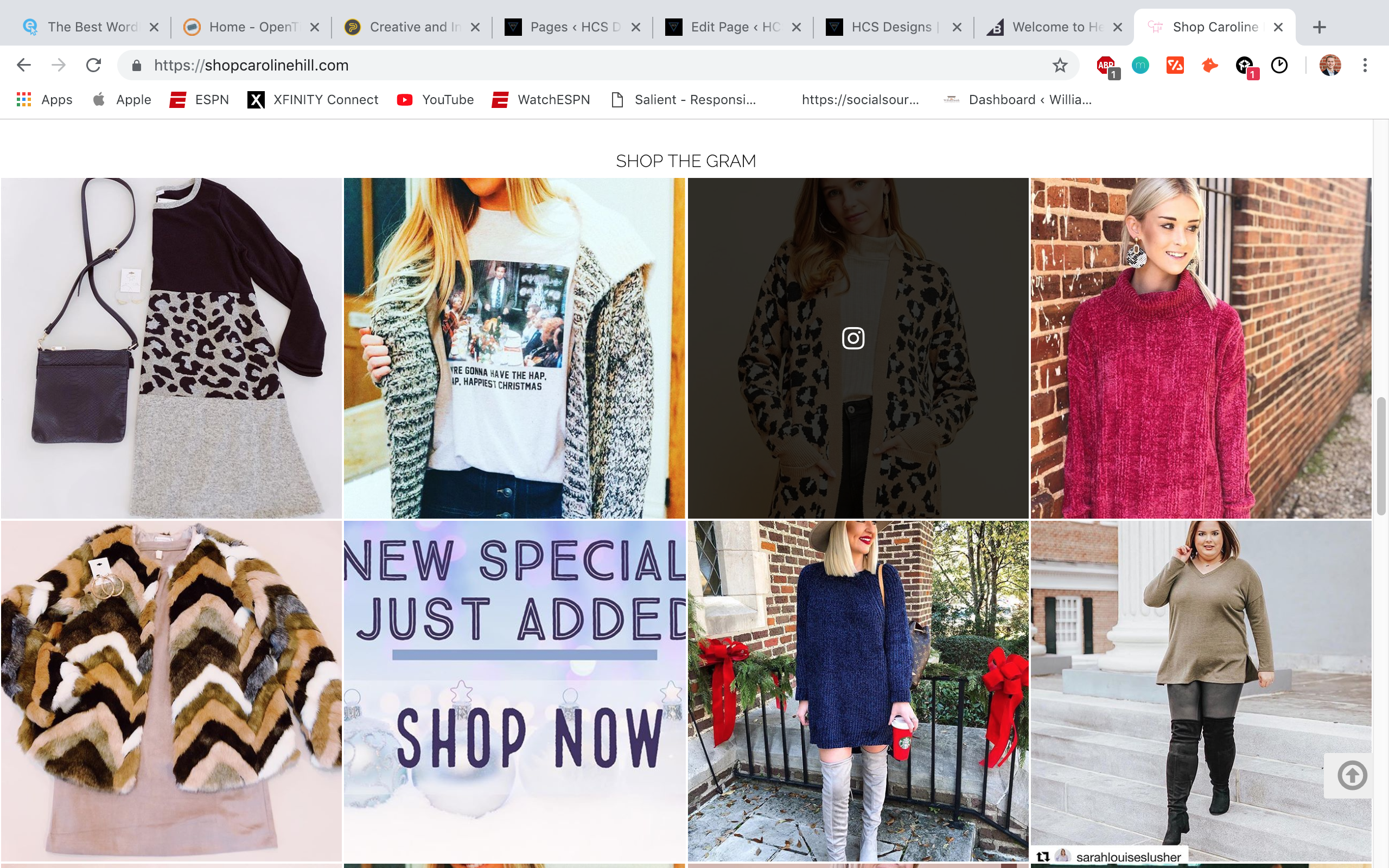
Recommended products section at the bottom of each individual product page, to encourage customers to continue shopping for more items based on products already in their cart
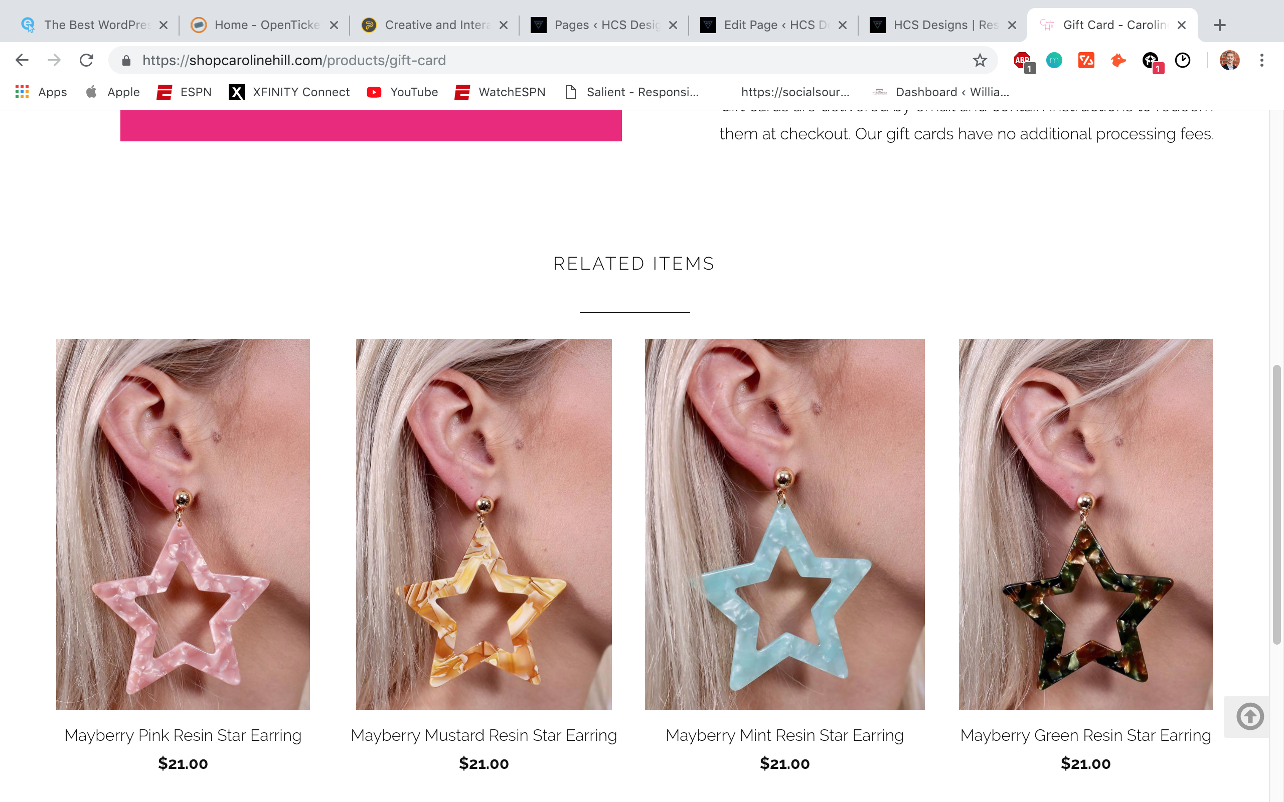
Recommended products section at the bottom of each individual product page, to encourage customers to continue shopping for more items based on products already in their cart
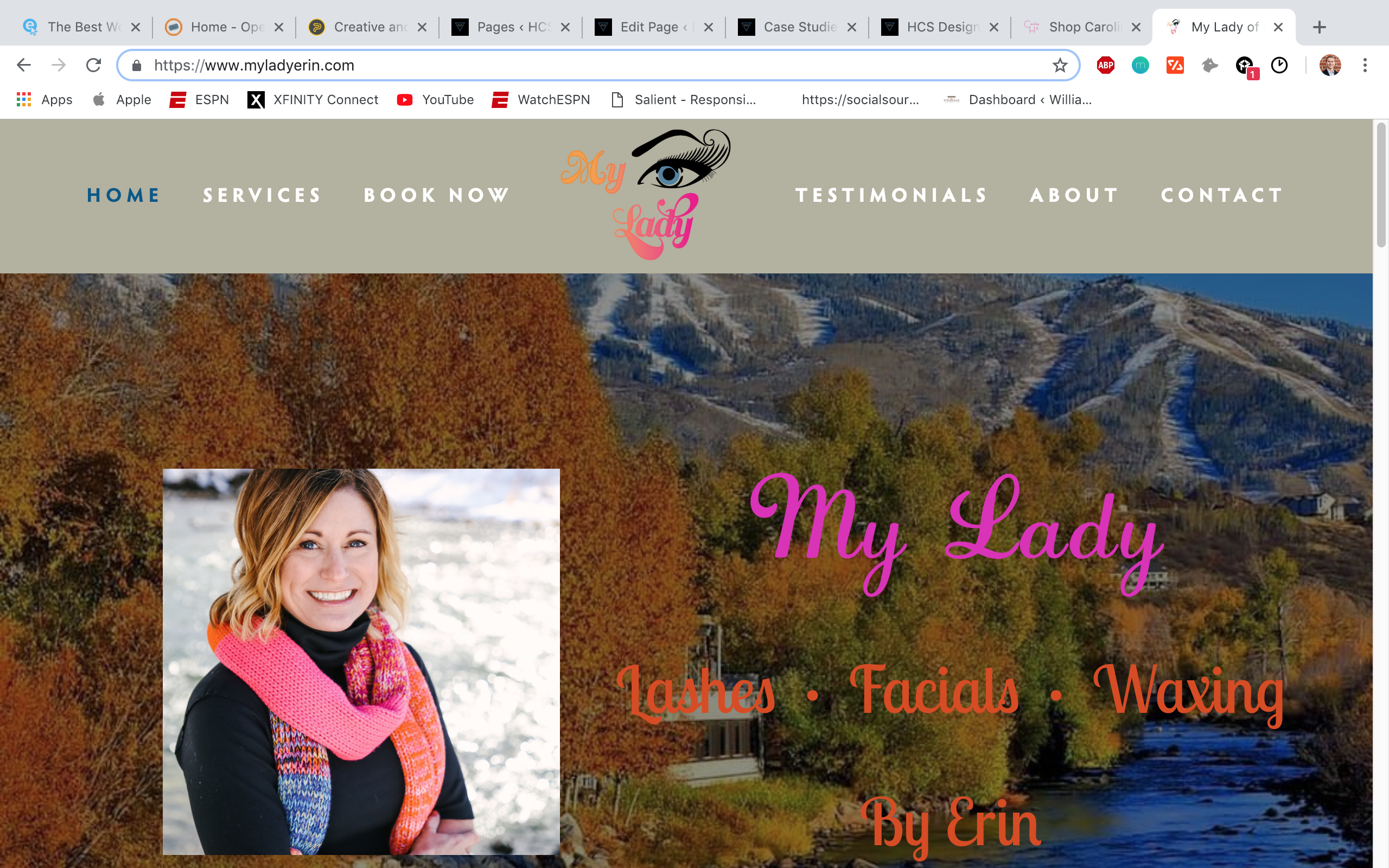
Bright inviting hero image, with overlaid picture of the owner, along with attention-grabbing fonts and font-colors.
Eye-popping logo in the center of the nav-bar
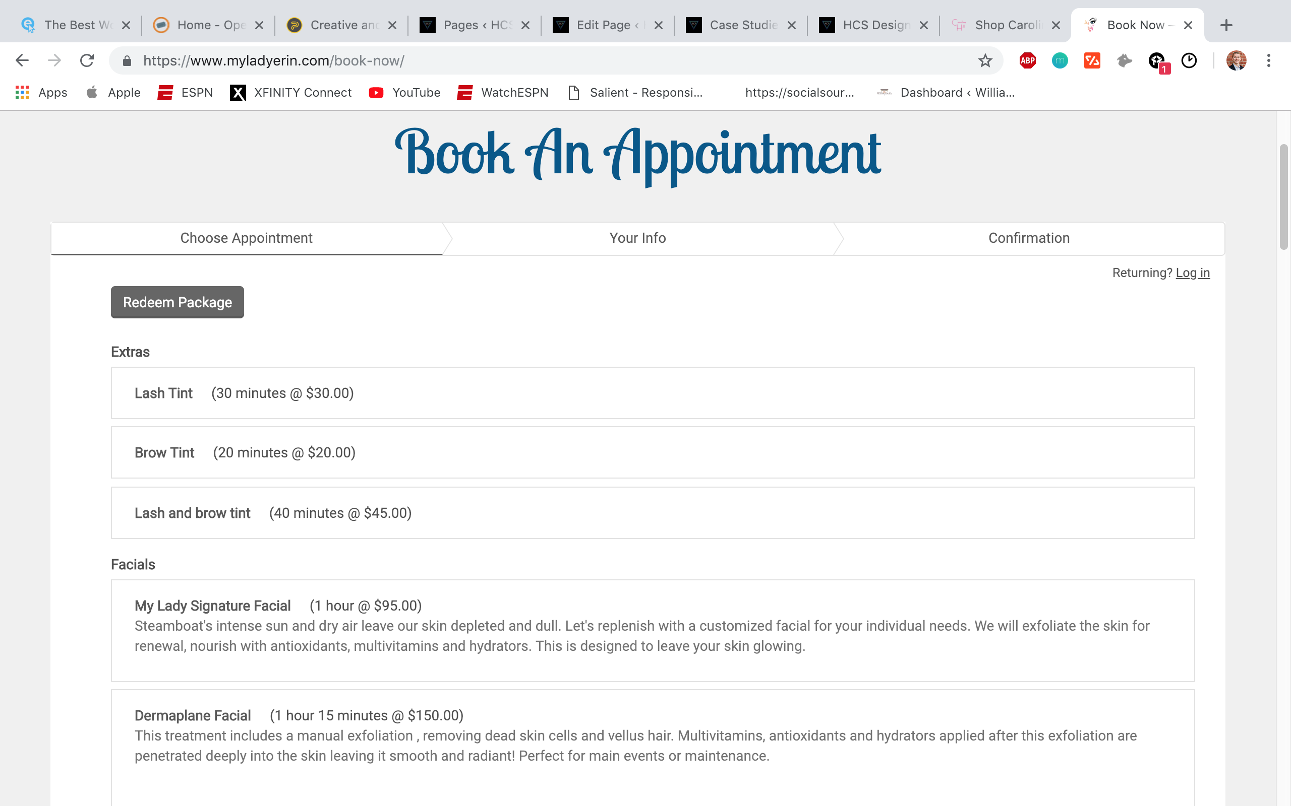
Booking page powered by Acuity Scheduling, allowing site visitors to schedule an appointment at their convenience for the service desired.
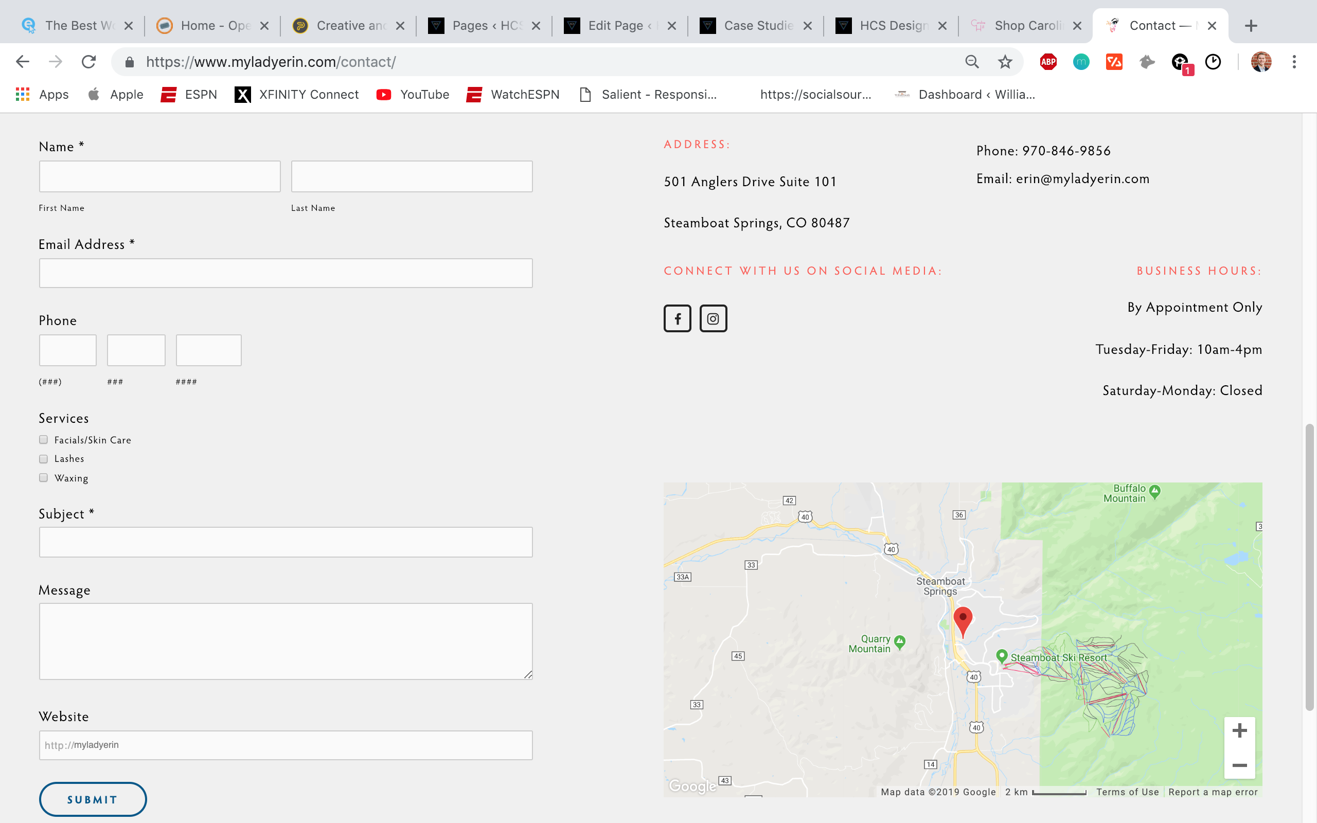
Contact form allowing site visitors to reach out to the business directly.
Social media buttons linking to the proper social media pages.
Google Maps showing the physical location of the business, which is clickable to take the user straight to Google Maps.